How the Snow Map Works: Snow, Freezing Level and Danger for Every Region
The coarse search for your day: where the snow fell, how high the melting reaches, and how every region's bulletin reads, on one map.
Coarse search, then fine search
Planning a day in the backcountry is two searches. The coarse search picks the region: where the storm went, where it stayed cold, which bulletins read better than others. The fine search picks the slope, inside that region: your own zones, their aspects and heights, their simulated snowpack.
The snow map is the coarse search. It puts every Avalanche Canada forecast region in BC and the Rockies on one screen, so you can rule out most of the province in a minute and spend your evening on the two or three regions that deserve it. This post explains what it shows, where every colour and number comes from, and where it stops being able to help.
What the map shows
The Layers button picks what colours the map. There are four layers, each answering one question:
- Snowfall, previous 2 days: how much new snow fell on the two days before the day you pick. The day itself isn't in it.
- Snowfall, today: how much falls on the day you pick.
- Max freezing level: how high the above-zero air reaches that day, at its highest.
- Highest danger rating: each region's top rating in its avalanche bulletin, across its three elevation bands.
The button beside it picks the day: today, tomorrow or the day after. One day drives everything. The colours, the numbers, the compare table and your zones' pins all follow it, so nothing on screen is quietly talking about a different day. "Today" always means the day you picked: pick Friday, and "Snowfall, today" is Friday's snow, and "previous 2 days" is Wednesday and Thursday.
Why split the snow in two? Because a skier asks two different questions: where has the snow piled up, and is more coming on the day. One total would blur them. Kept apart, you can spot a region that got a lot and is now clearing, or one that's dry so far with a storm arriving.

Where the colours come from
The snow and freezing level colours are Environment and Climate Change Canada's own weather models, drawn square by square across the mountains. We download the raw model grids from Environment Canada's open data service and do the rest ourselves: add up each day, work out the freezing level, clip the result to the regions and colour it.
- Today and tomorrow come from HRDPS, Canada's high-resolution model, which sees the land in squares 2.5 km across. At that size, individual ranges and valleys show up: you can watch snow pile onto the windward peaks and thin out in the valleys between them.
- The day after tomorrow is past HRDPS's reach, so it comes from RDPS, in 10 km squares, smoothed a little so the squares don't read as tiles.
- Each day comes from one forecast. A day's colours are drawn from the last model run that started before that day did, so a day is one coherent forecast from start to finish, never two stitched together.
The map updates twice a day, from the runs that start at 5 AM and 5 PM Pacific. The models run more often than that, but twice a day is plenty for planning, and it keeps the map on the same clock as the rest of the app.
Colours in bands
Each layer is drawn in ten bands with hard edges, not a smooth blend. A blend looks elegant but hides differences: two shades of orange 3 cm apart are hard to tell apart. A band boundary is easy to see, and the strip along the bottom of the map labels every one. Snow runs from greens through yellow, orange and red to purple and blue as it deepens, and the same colour means the same depth on both snow layers. Freezing level runs from deep blue under 500 m to purple above 2,500 m, in 250 m steps, so a drainage that's 250 m colder than the next one shows as a different colour.
From water to snow
Weather models measure snow as the water it would make if you melted it. We turn every millimetre of water into 0.7 cm of snow, a 7 to 1 ratio, everywhere in the app. Real snow varies storm by storm: wet coastal snow can be close to 7 to 1, while cold Rockies snow is often 15 to 1 or fluffier. We chose one ratio so that every snow number can be compared with every other, on the map, in the tables and in the compare table. It means cold interior storms probably read shallower than they are. A ratio that changes with temperature is on our list.
Rain or snow, and the freezing level
Both of these depend on one thing: how warm the air is up high. A thermometer at the trailhead doesn't tell you that, and neither does a guess based on it.
Think of the sky above a region as a skyscraper. The weather model reports the air temperature on nine floors, from near sea level to about 4,200 m. To find the freezing level, we walk up the building, find the last floor that's still above 0°C and the first one above it that's freezing, and work out where between them the air crosses zero.
- The highest of the day. The map checks the freezing level every 3 hours through the day and shows the highest, because the highest point is how far up the melting reaches.
- A warm layer above a cold one. On a cold valley morning, warm air can slide in above. When that happens we use the top of the warm air, because that's the highest place snow is melting.
- No guessing from the ground. A common shortcut assumes the air cools by a fixed amount as you climb. When we checked that shortcut against the model's real temperatures aloft, across about 110,000 spots in BC, it was off by more than 300 m in about 4 spots out of 10. Right on average, wrong where you're looking.
The same air decides rain or snow in the region numbers. At 0°C or colder, precipitation counts as snow; at 2°C or warmer, as rain; in between, as a mix (at 1°C, half and half). Snow can reach the ground with the air a little above freezing, and a gradual change fits that better than a hard line at zero.
The numbers: a region's preview and the compare table
Colours are good for shapes. For a decision you also want a number you can line up against another region's. Tap a region and its preview opens: its danger rating, then four numbers for today, tomorrow and the day after, side by side. Tap Compare and every region on screen (or just your favorites) lines up in one table, one row each, sorted by whichever column you tap.

There's no combined score and no "best" row, on purpose. Avalanche Canada advised against go or no-go guidance, and we agree: the table lines the facts up, and you make the call.
Five points per region
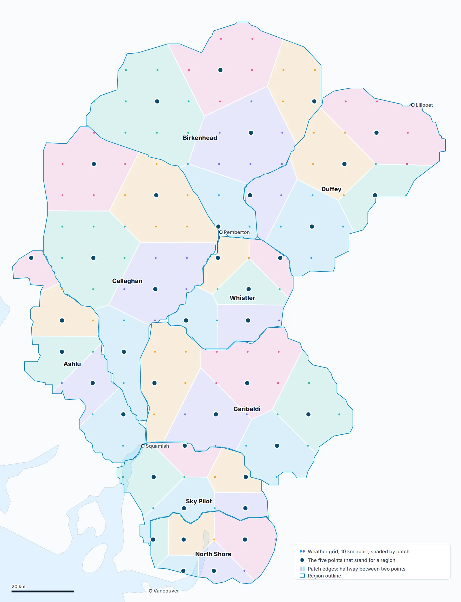
A region like Garibaldi takes in sea-level inlets and icefields. A storm can bury one end of it and barely touch the other, so no single weather point can speak for it. Each region's numbers come from five points spread across it.
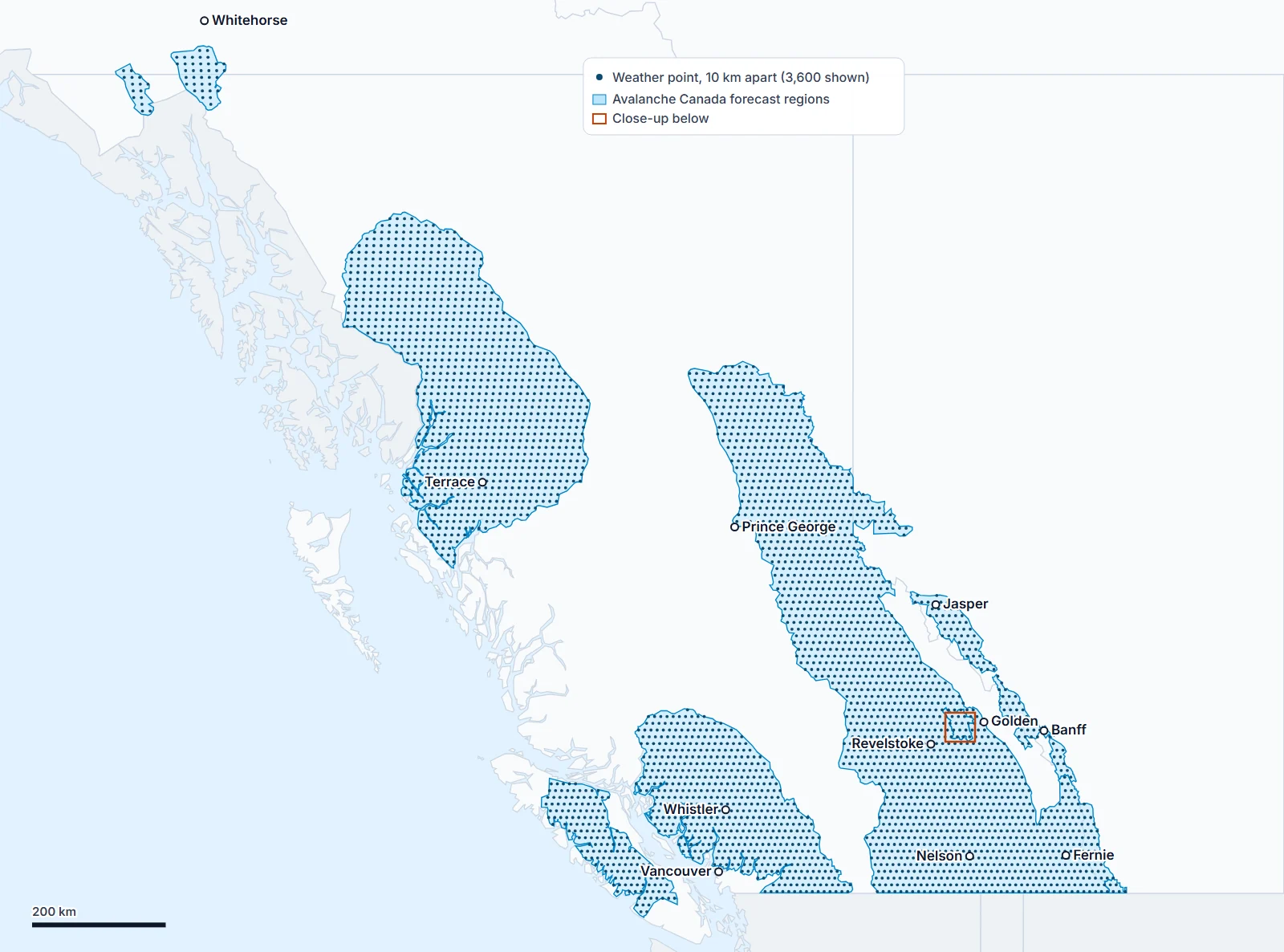
Snow Doctor keeps weather for a grid of about 3,800 points, 10 km apart, over every Avalanche Canada forecast region. It's the same grid our simulated snowpack runs on. Each region's five points are picked from it:
- The region's grid points are grouped into up to five neighbourhoods, so each one covers a part of the region.
- One point stands for each neighbourhood: the one whose ground sits closest to the region's middle height. That keeps the samples on mountain ground rather than valley floors.
- Each point counts for its neighbourhood's share of the region. A small corner holding under 5% of it is left out.
These are the same five points a region's simulated snowpack uses, so the weather you read and the snowpack built from it always agree on where they came from. Five isn't a fixed number. We're looking at ten points per region, and checking first whether the finer split changes the numbers enough to matter.
The weather at each point is Environment Canada's GEM models (high resolution for the first two days, then the regional and global models), fetched at the region's three heights after every new run. A region's number is the average of its five points, with the bigger parts of the region counting more, at the region's upper height. Those heights span the region's own terrain, so they aren't Avalanche Canada's elevation bands: the North Shore's upper height, for example, is 1,600 m.
When the colours and the numbers disagree
The colours and the numbers are worked out separately: the colours square by square from the model's grid, the numbers from five points at one height. Most of the time they tell the same story. When they don't, it's information, not a bug. A storm that hit one corner of a region shows as a hot spot in the colours and as a more modest average in the numbers. Read the colours for where, and the numbers for how much, compared with the next region.
Legacy mode: the five patches
Before the map drew Environment Canada's grids, it drew each region as up to five patches, one per weather point, each showing that point's own snow. It's still there: switch on Legacy beside Snowfall, previous 2 days in the Layers menu.
Every place in a region belongs to whichever of its five points is closest. The line between two patches sits exactly halfway between their points. Nothing overlaps inside a region, because every spot is closest to exactly one point, and patches stop at the region's outline, so a patch never spills into the next region.
What it can't see
A map you can trust is one whose limits you know. These are the ones that matter most, and how to work around each.
- Your slope. The finest model sees the mountains in 2.5 km squares, and the third day in 10 km squares. A gully, a cross-loaded slope or a sun crust on one aspect is far smaller than that. This is exactly why the map is the coarse search: once it has picked a region, your zones and their snowpack do the fine one.
- Wind. The models say where snow falls, not where the wind moves it afterwards. A lee slope can hold far more than the map's number, and a windward ridge can be scoured to the old surface. The bulletin's wind slab problem, and what you see on the skin track, fill that gap.
- What's underneath. The snow layers show new snow only. They don't show how deep the snowpack is, how the new snow has settled, or what it's sitting on. The bulletin and the Snowpack tab are where that lives.
- Measurement. Every number here is a forecast, including the previous two days. No weather stations or snow pillows feed the map. If the model put a storm 20 km from where it really went, so does the map. Field reports are the check.
- Distance in time. Tomorrow is less certain than today, and the day after is less certain again, and comes from the coarser model. Read the far day as a trend, not a total.
- The snow ratio. One ratio, 7 to 1, for every storm. Cold, dry snow is fluffier than that, so cold storms likely read shallower than they are. Compare regions with each other rather than reading a number as a depth to the centimetre.
- Cold surfaces. The freezing level is the air's. On a clear, calm night a snow surface can get colder than the air around it, and in a valley inversion the cold sits low, under warmer air. The map reads the air, not the snow surface.
- Hard edges. Bands have sharp borders and regions have outlines. The weather has neither: it changes gradually, and with terrain.
None of this replaces the avalanche bulletin, field reports or what you see on the ground. The map shows where the weather went. It doesn't tell you whether to go.
Credits
- Weather models (HRDPS, RDPS and GDPS) from Environment and Climate Change Canada: the map's grids through its open data service, MSC GeoMet, and each region's points via Open-Meteo. Data Source: Environment and Climate Change Canada. Contains information licensed under the Data Server End-use Licence of Environment and Climate Change Canada.
- Avalanche Canada and the other forecast centres for the bulletins and region outlines.
- Basemaps from Natural Earth. Map relief from SRTM and NRCan CDEM via Terrain Tiles. Contains information licensed under the Open Government Licence – Canada.
Questions, or a region where the map looks off? Write to hello@snowdoctor.ca.
Go ski good snow.